Note from MPWM: The views and market predictions expressed in this newsletter do not necessarily reflect the views of Momentum Private Wealth Management, LLC, or any of it's principals thereof.
CHEERS TO THE NEW YEAR!
We rang in a new year and a new decade; the champagne has long since popped and the confetti has been cleaned up! Our attention now turns from reflection on the 2010s to anticipation of what 2020 may hold. The bull market, which began in 2009, is now over ten years old. Judging by the incredible performance of 2019, it does not appear the bulls are quite ready to yield, however, there are those calling for the bubble to burst at any time. We find ourselves in the midst of a trade war with China. There are certainly increasing tensions with both Iran and North Korea. Stock buy-backs no doubt helped lift the market last year but are they poised to do so again this year? The Federal Reserve has not given many clues as to whether it will continue the current policy, which is currently quite favorable to investors. As we embark into an election year, the President still faces an impeachment battle. There is no shortage of themes that can serve as pitfalls for the bulls, however, many of these issues were also present last year and volatility remained relatively low. So, what is one to make of the coming year? Should we run for the hills or lean in for another strong year of market gains? Let’s gaze into the Magic 8 Ball and take a look.
AS GOES JANUARY, SO GOES THE YEAR?
January performance is widely watched as there is a belief, popularized by the Stock Trader’s Almanac, that if January shows gains, the market will be up on the year and, conversely, if January is down, the market will fall for the year. January of 2019 saw the S&P 500 rise 7.9% translating into a rise for the year of nearly 29%! How accurate is this January adage?
Unfortunately, this seasonality-based method is not very accurate. In examining the Standards & Poors 500 index (S&P 500) over the last 70 years - dating back to 1950 - the January-to-full-year correlation is
74.3%
accurate. Table 1 summarizes the S&P 500 data with the decades in the columns and the year of the decade in the row. For example, the year 1950 had a January increase of 1.5% and a total year-end (YE) growth of 21.7%. 1951 had January and year-end gains of 6% and 16.3%, respectively.
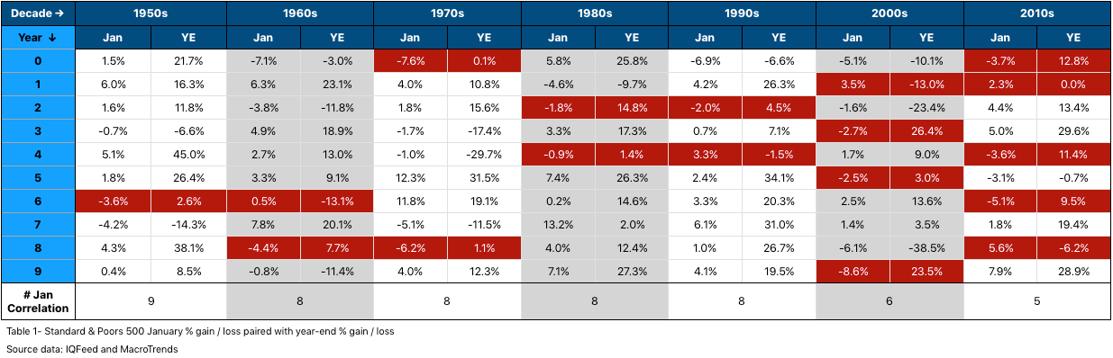
Further examination of the table illustrates the January-to-year-end correlation to be less relevant in the more recent decades. 1950 through 1999 averaged eight years per decade where January set the tone for the entire year. As we transitioned into the 2000s, the correlation is nearing 50%. Based upon this, I personally would not make portfolio decisions based on the performance of January. Perhaps a more current adage is: As goes January… there goes that theory.
YOUR VOTE COUNTS
2020 is a US Presidential election year. Does it matter to the market? Unequivocally, it matters!
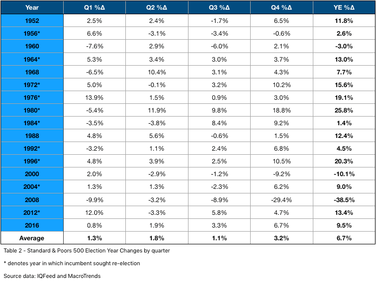
Table 2 illustrates the change in the S&P 500 index for every election year since 1952, broken by quarter. In these 17 election years, all but three have resulted in market appreciation during the year. The 1960 market had slight losses with the Vietnam war weighing heavily while the ‘Tech Wreck’ and ‘Mortgage Crisis’ affected 2000 and 2008, respectively.
On average, election year markets have appreciated
6.7%
over the last 68 years. Casting out the three down years raises the average gains to
11.9%
per year. Averaging all election years since 1952 where the incumbent President is seeking re-election, the yearly gains jump to
13.3%
.
Q1 gains are more muted, especially when an incumbent is not up for re-election, while Q4 tends to show the strongest overall gains aligning with the final outcome. Wall Street tends to shy away from uncertainty. In looking at the number of volatile days, +/- 1% change between sessions on the S&P 500 index, Q1 of election years tend to have more, especially when there is no incumbent. This aligns with the Primaries, where there is more uncertainty in the candidate that will receive their party’s nomination. Usually, volatile days are less frequent in election years where the incumbent is on the ballot.
Never before has an impeached President sought re-election so we are somewhat in uncharted waters. In isolation, the fact it is an election year with an incumbent should be considered a positive sign for the market.
IT'S TIME TO PARTY LIKE IT'S 1999
Okay, it is about to get really technical so bear with me for a few minutes. The market cycles. To further confound analysts, there are cycles within cycles; meaning, the overall trend on a weekly chart may be pointing up but there is a pullback on the daily charts that makes it look like price is trending down. This causes price to appear random and unpredictable. I believe the key to successful investing is to be in the market when
higher timeframes
are
aligned
and in phase with
lower ones
. This is why looking across timeframes is crucial. Examining charts from 2019, show significant alignment between weekly, monthly, and quarterly timeframes. Thus, the markets rose and did so with gusto.
Here’s some good news: because all market movement is connected across timeframes, it follows distinct rules. Since there are rules, it has been my experience, that probable outcomes can be anticipated. To draw an analogy, eclipses occur because of geometrical relationship between the sun, Earth, and moon. Eclipses follow rules and one cannot occur if the moon is out of phase. Similarly, the market rarely will have a significant down-move if the higher timeframes are strong. The market seeks balance and harmony and, therefore, the higher timeframes would have to cycle into phase to support a selloff. The crash of 1987, the tech bubble popping in 200o, and the disastrous selloff in 2008 all had similar high timeframe formations that were in phase and supported the selloff. Want some great news? At the time of this writing, I do not believe there is a significant risk of the bull run ending in the near-term! Let me show you.
Market analysts utilize indicators to help them interpret the market and make predictions. An example of a simple indicator is a moving average of price. When price is above its moving average, it is a bullish sign. There are indicators to measure various market components, some are leading and some lagging. Over the past two decades, I have personally developed and built numerous market indicators and systems to aid my own personal market analysis. Momentum Private Wealth Management now has access to these sophisticated, analytical tools of which, three are highlighted in the charts below. In simplest terms, they measure the underlying strength of the market as well as the strength of a trend.
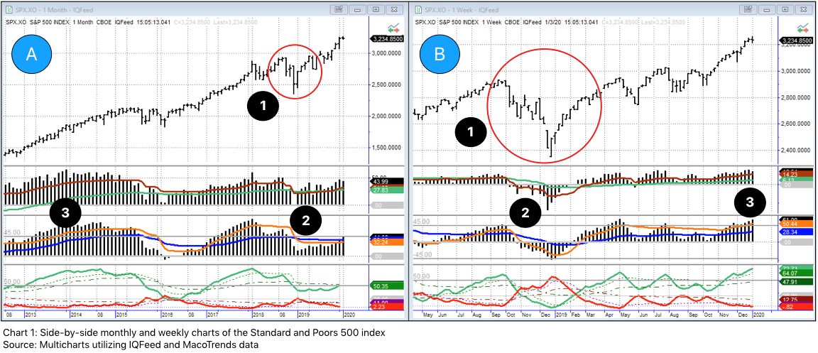
There is a lot to absorb in Chart I but it illustrates the current strength of the S&P 500.
- Price bars are in the top half of the charts.
- Proprietary market indicators are in the sub-charts in the lower half.
- Chart A is the monthly chart - each bar represents a month’s time.
- Chart B is the weekly chart - each bar represents a week’s time.
In chart A, we can plainly see price is generally trending upwards. #1 with the red circle encapsulates the Q4 pullback in 2018. It also illustrates how the timeframes are connected. Over the course of several weeks (chart B red circle), price fell rather dramatically. This equates to only three bars on the monthly chart (A).
Moving our attention to #2, the two histograms in chart B fell below zero and the red line moved above the green line in the bottom sub-chart, all bearish signs; however, the same indicators in chart A stay above zero and the green line remains above the red, all bullish signs. This is a classic counter-trend formation. The strength of the higher timeframe, in this case the monthly, temporarily yields to the lower timeframe (the weekly) but overcomes the downside pressure as it has greater support. It is important to note that some of the underlying strength is removed from the higher timeframe in this move. This is how markets ultimately change trend. The weekly (chart B) cycles through the down move and the indicators once again realign to resume the uptrend.
Callout #3 draws attention to the similarity of patterns and what can be expected in the near-term given the strength of the weekly chart. The current indicator formation at #3 in the weekly chart (B) are similar in formation to those on the monthly chart (A) at #3. It is reasonable to believe this move will continue for the next several weeks and likely longer given the supporting strength of the monthly.
Are you still with me? It is heady information indeed that has taken me years and years to fully understand. The main point is cycles are predictable with the right tools and currently the market appears to be strong.
What lies to the right of the current price bar is always a mystery since it is embedded in the future. An analyst only has the indicators and their patterns to rely upon. Finding a similar pattern that occurred in the past gives us a reliable forecast of what may transpire in the future. In examining the S&P 500 index, I found a very similar chart formation that may be a useful guide in predicting how this next year will play out. (Note: these same patterns occur across all markets and timeframes. This example is not an isolated association.)
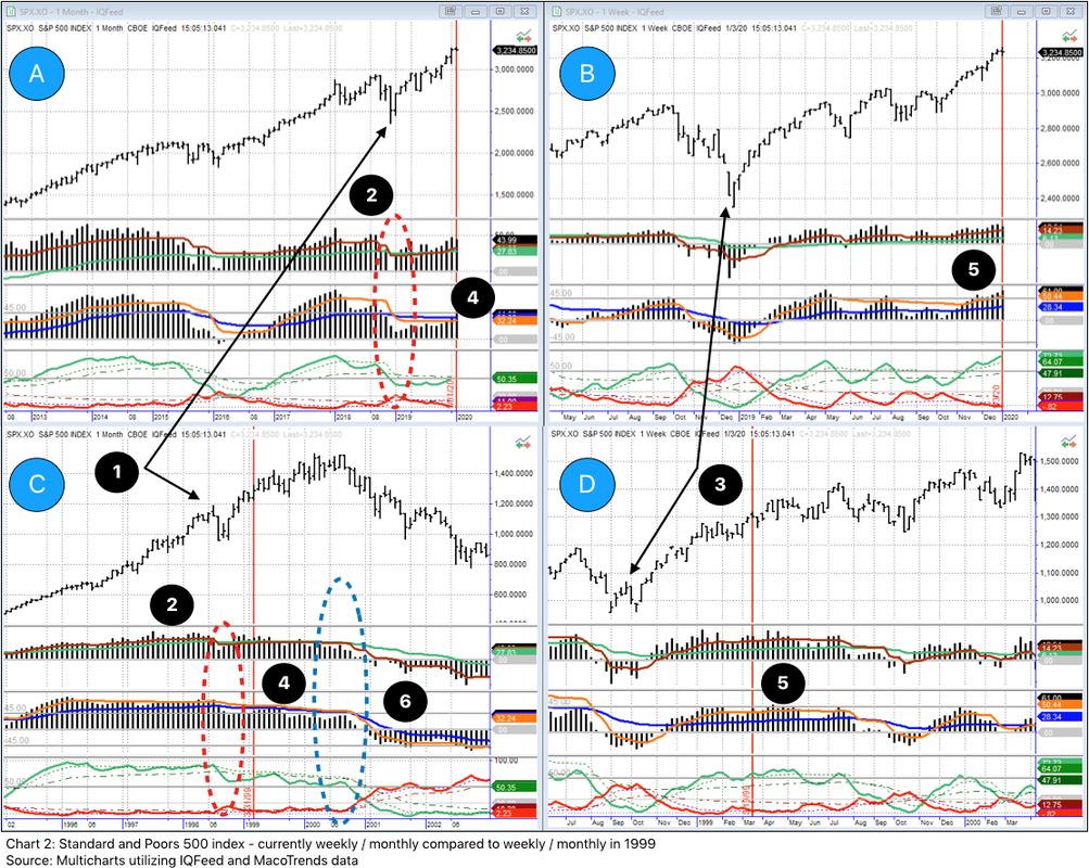
Rewinding all the way back to 1999, I found weekly and monthly formations that are extremely similar to what the charts show at the beginning of 2020. The benefit of examining the charts from 21 years ago is we can see what happened and use that as a blueprint for today’s strategy.
Chart 2 looks complicated but I will walk through the components and explain how what happened in 1999 will likely be similar to what we see in 2020 and 2021.
Similar to the earlier charts we walked through, price is in the top half of the four distinct charts. The same indicators as before are in the lower half of the charts. The S&P 500 index is in all four charts.
- Chart A is the monthly chart with the vertical red line representing the close on 1/3/2020.
- Chart B is the weekly chart with the same closing date as A.
- Chart C is the monthly chart with the vertical red line rewound back to March of 1999.
- Chart D is the weekly chart also centered on the March 1999 time period.
Looking at charts A and C first, we see that in both price is moving up to the left of the red vertical lines. The angle varies a bit but both are definitely increasing. You will also notice the indicators in the sub-charts are also generally similar in formation - the histograms are higher than the colored lines and the green line in the bottom sub-chart is above the red. Everything points to a strong, bullish market prior to the vertical red lines.
Moving our focus to point #1, we see a price pullback in both charts. Last year’s was a little briefer than in 1998 but both had price dips that pulled down the indicators as highlighted in callout #2 with the red ellipses. This indicates a pause point where the markets are out-of-phase between timeframes.
This pull back is more accentuated in point #3 in charts B and D. Because weekly bars make up the monthly bars - and it takes more of them - the decline at point #3 appears more exaggerated. If we were only looking at the weekly charts, we might have proclaimed in both instances the bull run was over, however, we would be wrong because the higher timeframe usually always wins the battle and the monthly indicators at point #2 (charts A and C) never dipped below zero indicating significant underlying strength in the move.
Points #4 and #5 on the monthly charts (A and C) and weekly charts (B and D), respectively, show the similar pattern of today compared to March of 1999. They are not identical but are very, very close. The weekly chart of today (B) at point #5 is less steep and more drawn out than chart D because of the choppy price pattern. All the same, it is in a strong formation.
After the vertical red line in chart C, price continues to rise until the last half of 2000. While this price increase looks fairly fluid on the monthly chart, you can see it is somewhat choppy on the weekly chart (D).
This is how market topping begins. The weekly chart continued to cycle in and out of phase with the monthly slowly drawing the indicators down below their support levels. Point #6 on chart C with the blue ellipse is a definitive warning sign the move is most likely over. The bull move is tired and will succumb to any strong force on a lower timeframe. You can see that price quickly fell once the indicators crossed the zero lines in chart C. That was the ‘Tech Wreck’ warning sign. In late 2007, there was a very similar formation and it is something we will continue to monitor through the new year.
I have a few final thoughts on where we are today in relation to 1999. First, in the late 1990s, semiconductors fueled a lot of the technology boom. This sector is often considered to be a leading indicator to both growth and recession. As highlighted in the recent
‘Closing out a Decade’
newsletter, it was highlighted that five of the top ten S&P 500 performers in 2019 were in the semiconductor space. The PHLX Semiconductor Sector index (SOXX) is extremely strong, suggesting continue economic expansion into the new year.
Secondly, the proprietary indicators that were developed are designed to compare markets and timeframes in an apples-to-apples manner. The underlying strength indicator is about half the value of the same indicator in March of 1999. This is both good and bad. It is good because a slower appreciating market tends to go farther but it is bad because it will take less energy from the lower timeframes to influence it.
Finally, the weekly S&P 500 index chart is very strong right now thanks to an incredible Q4 of 2019. When markets go up (or down) too quickly, they tend to need to adjust. Think of a rubber band that is stretched too far, the tension needs to be reduced or it will break. I believe in the near-term it will continue to climb, as stated earlier, but it will need to pause and consolidate before continuing a healthy, well-supported climb higher.
PREDICTION IS DIFFICULT, ESPECIALLY IF IT IS ABOUT THE FUTURE
Will the markets rise in 2020? If so, by how much? I will tell you on 12/31/2020. In all seriousness, no one knows for sure whether the markets will go up or down. What I believe is: the broader US markets are poised to go up because many indicators suggest further price appreciation. As pointed out earlier, it is an election year and that tends to translate into an up market. Interest rates are currently low - about half of what they were in 1999 - which favors equities. Corporate buybacks, while slowing, will likely inject hundreds of millions back into the markets again this year. China continues to inject stimulus into their economy, which bodes well for the US and the global economy as a whole.
Of course, there are headwinds. The geopolitical state of the world is precarious at the moment with trade wars and legitimate tension between the US and other counties. We have been in a tremendous bull run which seems to be accelerating. “Blow off tops” can definitely change the market very quickly. Quite simply, the market cannot keep going up forever.
In coming newsletters, I plan on dissecting market sectors and delving into potential movers. I will spend a little time with FAANG (+ Microsoft) as well. I have also turned my attention to crude oil - not because of recent news events with Iran - but because of its price movement. I noticed this initially in examining the Energy sector, which incidentally was the weakest of 2019. I am starting to warm up to Energy in a big way and will discuss it more in the coming weeks.
Over my years of study and investing, I have learned to weigh most heavily on what the market is doing right now and take what opportunities are presented. Right now, the market is going up. Personally, I believe - for all of the reasons outlined above - the market will continue to do so in the short- to medium-term. I would not be surprised if we saw the S&P 500 index appreciate between
18%
and
22%
this year. That would put the index around
3900
. We can revisit this on December 31st to see how it played out.
CLOSING THOUGHTS
Many investors become extremely worried the moment they start losing money, however, when they are making money there is often less scrutiny given to performance because… well, they are making money. I encourage you assess your portfolio and ask the question, “did I fully maximize my investment potential?” The S&P 500 index grew nearly 29% last year. After factoring out risk attributes, how does your portfolio index to that?
If reading through my explanation of how charts work made you glaze over, don’t worry. Technical analysis is not for everyone but I live and breath it. You can still take advantage of sophisticated analysis and tools by contacting Austin.
The New Year is a perfect time to review your portfolio and talk to a professional you trust to ensure your investments are working toward your long-term goals. The most important thing is to have a solid plan. If you currently have no plan or feel your current plan can be improved, MPWM can help!
Here’s to your health, wealth, and happiness in 2020.
Do you have a prediction for 2020? I would love to hear your thoughts so be sure to comment below!
If you are not having frequent conversations with your wealth or investment advisor about market strategies, investment management, or financial planning opportunities, you should be.
Momentum Private Wealth Management
specializes in Wealth Management as well as Comprehensive Financial Planning. Feel free to reach out to Austin directly at 512.416.8085 or austin@momentumpwm.com. You can also find out more information about MPWM at:
www.momentumpwm.com
.
The views and market predictions expressed in this newsletter do not necessarily reflect the views of Momentum Private Wealth Management, LLC, or any of it's principals thereof.
Justin Toedtman is a market strategist and contributing editor to Momentum Private Wealth Management. For the last 20 years, his focus has been on technical analysis and market strategies.
The information on this site is provided “AS IS” and without warranties of any kind either express or implied. To the fullest extent permissible pursuant to applicable laws, Momentum Private Wealth Management, LLC (referred to as “MPWM”) disclaims all warranties, express or implied, including, but not limited to, implied warranties of merchantability, non-infringement, and suitability for a particular purpose.
MPWM does not warrant that the information will be free from error. None of the information provided on this website is intended as investment, tax, accounting or legal advice, as an offer or solicitation of an offer to buy or sell, or as an endorsement of any company, security, fund, or other securities or non-securities offering. The information should not be relied upon for purposes of transacting securities or other investments. Your use of the information is at your sole risk. Under no circumstances shall MPWM be liable for any direct, indirect, special or consequential damages that result from the use of, or the inability to use, the materials in this site, even if MPWM or a MPWM authorized representative has been advised of the possibility of such damages. In no event shall MPWM have a
ny liability to you for damages, losses, and causes of action for accessing this site. Information on this website should not be considered a solicitation to buy, an offer to sell, or a recommendation of any security in any jurisdiction where such offer, solicitation, or recommendation would be unlawful or unauthorized.