Note from MPWM: The views and market predictions expressed in this newsletter do not necessarily reflect the views of Momentum Private Wealth Management, LLC, or any of it's principals thereof.
The Market ignored bad news… until it didn’t.
In January’s
‘Crashing Up?’
newsletter, I highlighted a characteristic of a bubble market is ignoring bad news. For the first eight weeks of the year, that is exactly what the market did. The brief spat with Iran in early January was quickly dismissed by the market. Later that month, the Coronavirus (COVID-19) began making headlines as China underwent massive efforts to contain the spreading of the virus. The market didn’t care. As we entered into February, the virus continued to spread within China and to other Asian countries. The market didn’t care. In mid-February, major U.S. companies began revising quarterly guidance citing risk the Coronavirus would likely impact revenue. Still, the market didn’t care. And then, suddenly… it did care.
On the evening of Sunday, February 23rd, S&P 500 futures gapped down 30 points at the beginning of the trading session. By Monday’s market open, the S&P 500 was down over 100 points and never looked back. Coronavirus had spread to Europe and the number of cases, especially in Italy, were alarming. Predictions began to suggest the virus would quickly sweep through Europe and the U.S.; a true pandemic. Selling continued on Tuesday. On Wednesday, it appeared the bulls were regaining their footing mid-session only to have selling pressure accelerate into the close of the session. That selling pressure was full-throttle on Thursday with the S&P giving up over 140 points (-4.6%). The market was able to pair down losses on Friday, only giving up 10 points total, a significant recovery from the lows of the day.
All told, the Dow Jones Industrials surrendered
13.6%
on the week. The S&P 500 gave up
11.5%
and the Nasdaq Composite lost
10.5%
in the final week of the month. According to Wilshire Associates, U.S. shareholders are down $2.8 trillion from last week’s selloff and
$4.6 trillion
from February 19th’s market high.
1
To add perspective, on February 19th, the S&P 500’s all-time high, the companies comprising the index were trading at and average 91% of their 52-week highs. By Friday’s close, they were trading at 79% of their 52-week highs.
The top five companies falling farthest from their relative 52-week high are: Advanced Micro Devices (AMD) - the darling of 2019, Norwegian Cruise Line Holdings (NCLH), Lincoln National Corporation (LNC), American Airlines Group (AAL), and FLIR Systems (FLIR). AMD has a heavy reliance on China for both direct manufacturing and supplier manufacturing so that makes sense. NCLH and AAL both involve travel, something expected to take a significant hit until Coronavirus is completely contained.
Was it really that bad?
In historical terms, how bad was last week’s sell-off? Scanning the S&P 500 index dating back to 1950, last week’s selloff ranks
fourth
overall in terms of percentage drop. So, it was pretty bad. Table 1 summarizes the top five weekly declines (by percentage).
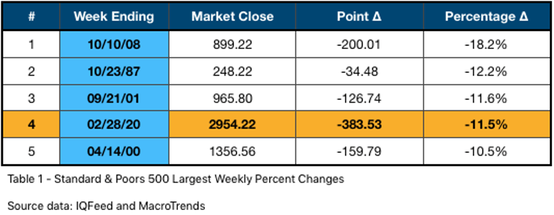
There are some familiar time periods in the table above: The Financial Crisis of 2008, Black Monday (1987), and of course, the week following the September 11th attacks.
Where do we go from here?
Before we can address the question, where do we likely go from here, let’s examine what happened after the other massive single week selloffs. Table 2 below highlights how the S&P 500 index performed after the massive sell-off weeks.
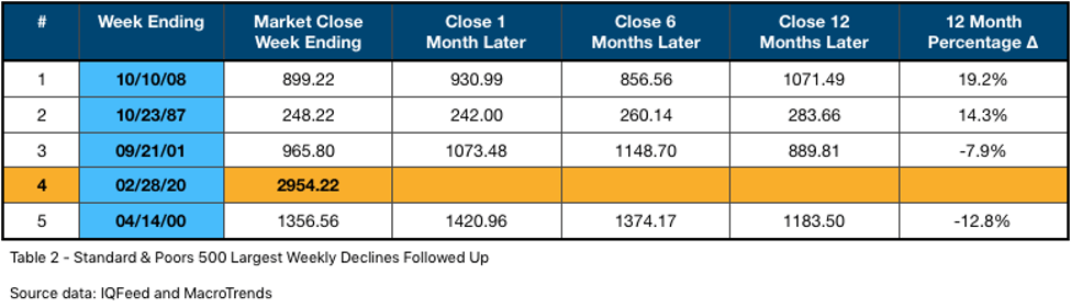
A month after the sell-off week, three of the four periods saw modest gains. Unwinding the Savings and Loan crisis of the late ‘80s took a little more time. Six months after the sell-off week, again three out of the four periods showed appreciation. One year of the sell-off week, again, is a mixed bag with two periods posting substantial gains and the other two deepening their losses. Yes, this is a very small sample size with little statistical significance. So, let’s take a look at what the charts looked like in these periods and see how they compare to today.
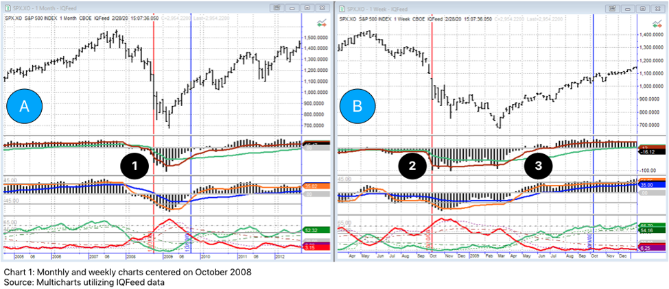
First, let’s examine October of 2008. I will quickly orient you to the charts. Chart A is a monthly chart and Chart B is a weekly chart. As I have mentioned in past newsletters, it is vitally important to look across timeframes as the market is made up of cycles within cycles. Price is in the top half of the charts and three of my proprietary indicators are added to the lower half of the charts. The red vertical line is the week of the significant selloff, in this case October 10th, 2008 with the blue vertical line representing one year later. Take note of the histogram formation near points 1 and 2. The formations are very similar between the two charts. On the weekly chart (Chart B), you may notice the top histogram is below a zero line and “trapped” by its moving averages (directly above Point 2.) This consolidation is very bearish and the significant breakout, downward, occurs the week prior and “follows through” during the week of the the 10th and subsequent weeks. The bottom indicator (below point 2) has the red line ascending, again, another very bearish formation that is present in both charts. Despite price continuing to drop (in Chart B), the formations of the indicators are less extreme - divergent to price - and ultimately gained moving average support. Near point 3, the indicators cross zero and begin their climb to what would result into a ten year bull market. (Reference my newsletter, ‘Bulls On Parade’ for more on the decade-long rally.)
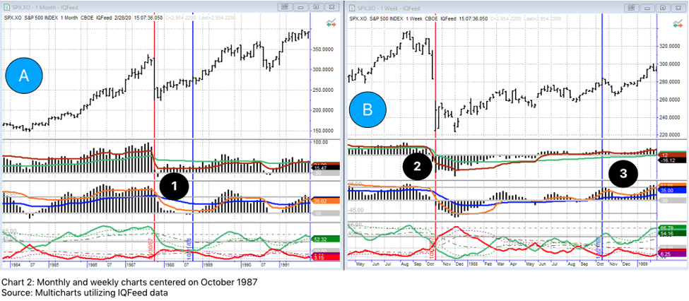
Chart 2, above, rewinds back to Black Monday and the crash of 1987. The chart setup is identical to what was walked through in the 2008 example. One thing of particular importance to highlight is the indicator formation of the monthly chart (A) at point 1. If you recall, the monthly chart in 2008 had the top two indicators below zero and the red line was above the green in the bottom indicator. In this example, prior to the sell-off, price was trending strongly upward. In addition, the indicators were above their respective moving averages, a bullish formation. Keep this formation in mind for later. One final callout before we leave Chart A, the green line at the bottom of the chart is a bounded indicator, ranging between 0 and 100. The value before the red line is 86, which indicates an overbought situation. (For more information on this indicator, please reference the
‘Amped On Tesla’
newsletter.)
If you look at the weekly chart (B), you will notice prior to the red vertical line, near point 2, the indicator is above the zero line but is trapped by the moving averages. This often points to underlying weakness and often results in price moving lower ultimately resulting in the indicator crossing zero and trending downward, as it does in the weeks following the red vertical line. The market recovers and by point 3 on Chart B, the indicators are above zero and their moving averages again to slowly begin climbing higher.
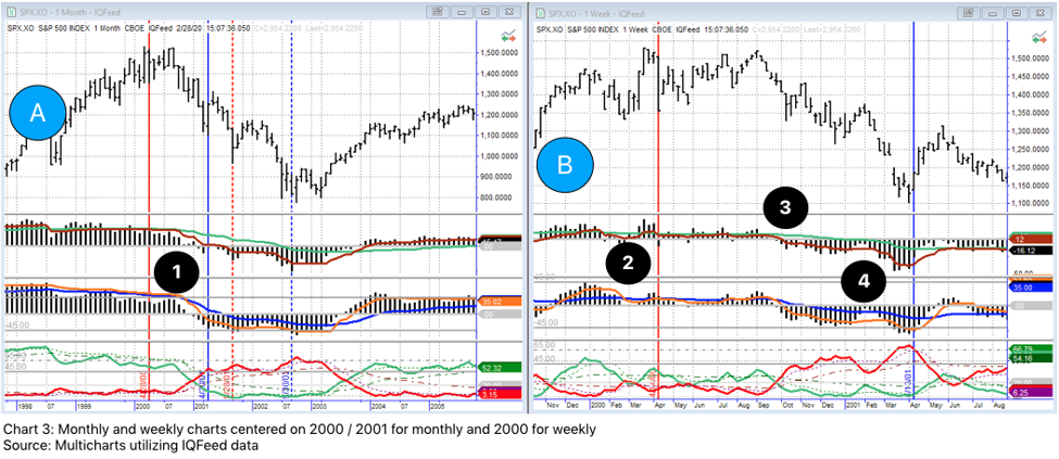
It makes sense to talk about the 2000 and 2001 down moves together since they are actually parts of the same move. Chart 3 below contains the monthly and weekly, as before. The solid red and blue lines on Chart A are the April 2000 move and the dashed vertical lines are the September 2001 move, which we will look at in a moment.
In Chart A above, price is steadily trending towards all-time highs just before the solid red vertical line. The issue is, the underlying strength of the move, as interpreted by the top two indicators hints at problems. Classic divergence -price increasing but the indicators failing to sustain higher highs along with price - occurs. To make matters worse, the indicators are trapped by their moving averages, a bearish sign indeed.
Chart B is interesting in that the indicators are not in the trend-mode we observed in the earlier examples. Both the price movement and indicators look choppy. Both, before and after the vertical red line and after Point 2, price appears to move sideways. This is actually a common occurrence when the higher timeframe (Chart A) has its indicators trapped by the moving averages as illustrated by Point 1. The substantial down move is quickly metabolized and eventually all-time highs are re-tested just before Point 3. Price begins to succumb to downward pressure just after Point 3 and more of a classic trend pattern is established by Point 4. It is around this time when the indicators on the monthly chart drop below zero and will accelerate the down move into fall of 2001.
Chart 4 has the same monthly Chart A as the last example. Chart C is the weekly timeframe and is centered on 2001 - 2002. Coming out of the Tech Wreck of 2000, you can see that price is clearly trending downward on Chart A. Point 1 illustrates the indicators are firmly falling as we approach the vertical dashed red line. After the attacks of September 11th, the market actually briefly rallied off the lows after trading resumed. Point 2 illustrates the red line in the bottom indicator has a value just over 65 indicating over-sold market conditions.
During this period, the weekly chart is out-of-phase with the monthly as its indicators are below zero while the weekly indicators above their moving averages and hovering near zero. The market starts to trend sideways, Point 3, as the charts work out their temporary disagreement. The higher timeframe, the monthly, wins the battle and price is further pressured to the downside. At the end of July 2002, Point 4, the red bottom indicator is at 87, severely oversold, and the market takes a breath, retests the lows again later in 2002 and eventually, another bullish cycle begins.
We have just walked through the context, from a technical analysis perspective, of four of the top five largest weekly sell offs since 1950. It only seems fitting that we take a look at our current charts to see if we can apply what has happened in the past to today’s situation.
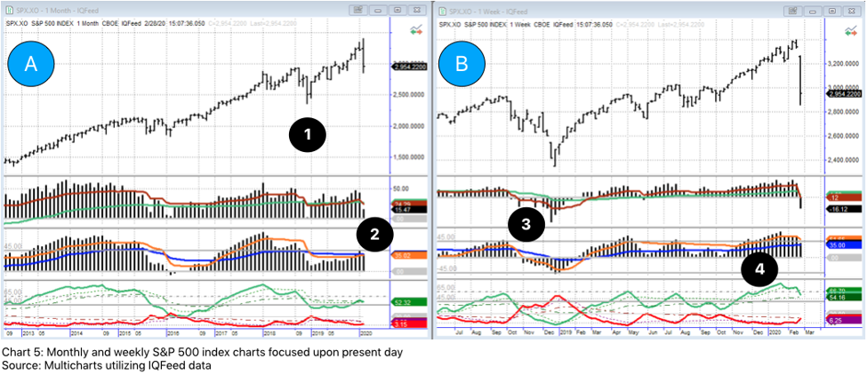
Chart 5 is the current S&P 500 monthly (A) and weekly (B) charts. The first thing to note on Chart A is the very strong price trend over the past few years. There was a bit of a pullback at Point 1 (late 2018) that corresponds with Point 3 on Chart B. There was quite a bit of strength going into that pullback and the lower weekly timeframe quickly cycled through and became bullish, realigning with the monthly.
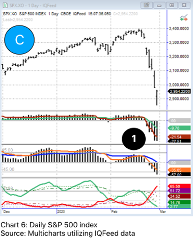
Coming out of January on both charts, the top indicators were above their moving averages and looked strong, however, the middle indicator (blue and orange lines) at Point 2 never got above its moving averages since the pullback mentioned earlier. This is not a particularly strong sign. On chart B at point 4, the green line in the third indicator is above 80, again signaling a potential overbought situation. The market succumbs to pressure appearing in the daily chart 6.
Point 1 on Chart C illustrates three things of concern: a) price is making divergent highs compared to the top indicator which begins to become entangled with its moving averages, b) the middle indicator is trapped by its moving averages, similar to the monthly chart formation above (Chart A, Point 2), c) the bottom indicator is trapped by its own moving averages (dashed lines) after coming off the indicator’s double-top in December and January.
All of this pointed towards the opportunity for a pent-up down move should the right catalyst come along. Enter Coronavirus and potential pandemic.
Putting it all together
Is the Coronavirus going to sicken this decade-long rally? Reflecting upon the chart examples reviewed earlier, I am inclined to think it is not for the following reasons:
- The current monthly and weekly chart formations do not appear to support a rally-ending, crash-type move.
- There is still significant support, from a technical perspective, in the higher timeframes.
- The quarterly chart, which is highlighted below, still contains a considerable amount of underlying strength
- I expect The Fed as well as other Central Banks around the world to take action to avoid near-term recession, which will inject additional bullish energy in the markets.
- There will be an impact to short-term revenue but I expect Wall Street to shrug this off; traditional valuations are skewed for the most part anyway.
Chart 7 is the quarterly S&P 500 chart. Point I is near the 1987 sell-off, note the indicators above their moving averages, similar to what we see in the present day chart on the monthly. This aided the quick recovery cited earlier. Point 2 is the 2000 and 2001 sell-offs. Notice how the indicators peaked and were receiving pressure from their respective moving averages before the selloffs occurred. Point 3 is before the Financial Crisis of 2008. Note how the top indicator never fully recovered (remained below its moving averages.) Our current quarterly chart formation is much more similar to that of 1987 than that of 2000 or 2008.

The fact the S&P 500 index rallied into the close Friday (2/28) gives me the impression the market is close to finding some footing. This singular price action is not cemented in support and resistance but it is the hint of a change of sentiment. Of course, fear (of the unknown) is the main driver right now so the slightest injection of bad news could send us lower. The market is attempting to price in the unknown impact of this virus and I do expect a good deal of volatility to continue in the near-term. I would not be surprised if we are nearing a bottom as we are becoming more oversold - not extreme just yet, but close.
Make no mistake, I do believe this selloff has done lasting, technical damage to the higher timeframe charts. I also firmly believe, in time, these high timeframes will cycle through to the downside and will ultimately result in a bear market. I do not think that will happen immediately or even this year. In my newsletter,
‘2020 Vision’
, I predicted the S&P 500 index to appreciate between 18% and 22% this year. We are down about 8% on the year - all of it coming this past week - but I think we dig out of this hole. It is probably a little early to jump into ‘bargain hunting’ mode but if the Coronavirus is contained, it might be a good idea to entertain. Please also remember that the markets will do what they want and I could be completely wrong about where this market is heading.
People who invest often have the expectation they will make money and are often much more sensitive to losing it than to making it. $4.6 trillion in profits evaporated in less than 10 days. It might be a perfect time to review your portfolio and talk to a professional you trust to ensure your investments are working toward your long-term goals. After significant market moves, like the one we witnessed last week, is when portfolio recalibration can be helpful.
Disclosure:
At the time of writing, I have no open position in any aforementioned company. I have not received compensation for this piece nor do I have business relationships with any company whose stock is mentioned in this article. I wrote this newsletter myself and it expresses my own thoughts, opinions, and views.
1 barrons.com (
https://www.barrons.com/articles/didnt-sell-before-the-big-plunge-heres-the-good-news-51582941369
)
If you are not having frequent conversations with your wealth or investment advisor about market strategies, investment management, or financial planning opportunities, you should be.
Momentum Private Wealth Management
specializes in Wealth Management as well as Comprehensive Financial Planning. Feel free to reach out to Austin directly at 512.416.8085 or austin@momentumpwm.com. You can also find out more information about MPWM at:
www.momentumpwm.com
.
You can also read more about Austin on his
LinkedIn Page
,
CFP® Professional Certificate Page
or on his
XY Planning Network Profile page.
The information on this site is provided “AS IS” and without warranties of any kind either express or implied. To the fullest extent permissible pursuant to applicable laws, Momentum Private Wealth Management, LLC (referred to as “MPWM”) disclaims all warranties, express or implied, including, but not limited to, implied warranties of merchantability, non-infringement, and suitability for a particular purpose.
MPWM does not warrant that the information will be free from error. None of the information provided on this website is intended as investment, tax, accounting or legal advice, as an offer or solicitation of an offer to buy or sell, or as an endorsement of any company, security, fund, or other securities or non-securities offering. The information should not be relied upon for purposes of transacting securities or other investments. Your use of the information is at your sole risk. Under no circumstances shall MPWM be liable for any direct, indirect, special or consequential damages that result from the use of, or the inability to use, the materials in this site, even if MPWM or a MPWM authorized representative has been advised of the possibility of such damages. In no event shall MPWM have any liability to
you for damages, losses, and causes of action for accessing this site. Information on this website should not be considered a solicitation to buy, an offer to sell, or a recommendation of any security in any jurisdiction where such offer, solicitation, or recommendation would be unlawful or unauthorized.