Note from Austin at MPWM:
In the time period between Justin completing this piece and my review/posting process, a few things (!!) have changed that warrant an update:
- The Senate has passed a $2.2T (Yes, Trillion) Coronavirus Aide bill sending it to the House. The House is expected to pass the bill on Friday and send it to the desk of President Trump for signature.
- The S&P 500 is up almost 13% for the week (as of the writing of this)
- The United States had the highest number of reported CoronaVirus deaths yesterday, 233. (Wednesday)
- Reported today, Initial jobless claims soared to 3.2 Million Americans last week, the highest number of initial jobless claims in history.
As you read Justin's detailed piece below, I urge you to pay particular attention to his analysis with this new information at hand and I hope you come away as enlightened as I did. Regardless of the current market upswings, we continue to face some major headwinds and I am just as concerned about the market and economy today as I was on Friday.
As always, the information and market predictions contained in his piece do not necessarily reflect the viewpoints of MPWM. Enjoy!
-Austin
Let’s Take a Quick Temperature Check
Ahhh… spring, when the trees begin to bud, the flowers begin to bloom, spring showers are frequent, the days get longer, bears come out of hibernation, the markets melt down… wait, what? It has been a few weeks since my last article - an unintentional virtual social distancing - and a lot has occurred in the markets. Let’s level-set before we move on. As of Friday’s (3/20/2020) close, the Dow Jones Industrials are down
-32.9%
(9,410), the NASDAQ composite is off
-23.1%
(-2066), and the S&P 500 index is down
-28.7%
(-926) since the beginning of 2020. Compared with the 2/19/2020 market highs, the indexes are off an average of
-33%
. For reference, a bear market is defined as a drop of 20% or more. Yes, the bears are back in town.
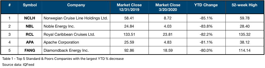
A quick scan of all the companies comprising the Standard & Poors (S&P) 500 index, were are an average 11.8% off the 52-week lows (weighted by stock price.) This is a stark change from just one month ago where that same number was 68.8%, meaning most companies were well above their 52-week lows. In fact, nearly 20% of the S&P 500 companies are either at or are within 2% of their 52-week low as of Friday’s close (3/20/2020). Table 1 highlights the five S&P companies with the largest percentage change year-to-date. Two of the companies are cruise lines and three are energy companies. What is going on in the world of energy is quite interesting and will be featured in a future newsletter.
It’s not all sour grapes, there are some companies posting gains on the year. Regeneron Pharmaceuticals [REGN] (+16.8%), Clorox [CLX] (+15.5%), and Gilead Sciences [GILD] (+12.7%) are appreciating for obvious reasons.
Stepping into a Time-warp
You are likely familiar with the adage, “those who do not learn history are doomed to repeat it.” In my market analysis I often reference historical charts as I have observed the markets frequently repeat formations and patterns. If we learn from what happened before, it increases our odds of success in the present.
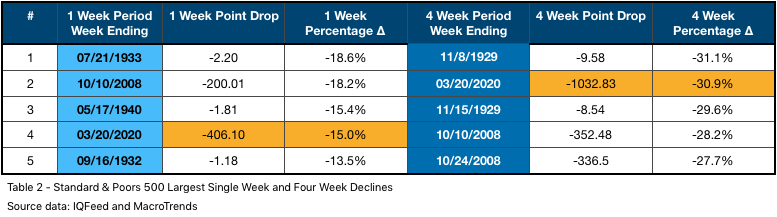
The S&P 500 index has not seen these price levels since January 2017. Effectively, three years’ worth of market gains have been erased in a month’s time. This is indeed historic. The market has dropped at near-record pace. Table 2 illustrates this past week as the fourth largest, single week drop for the S&P 500, in terms of percentage. When expanding the range to a four week period, we take over the second position, sandwiched between a period dating back to 1929. It is a bit disconcerting that we are in mixed company with milestones set in both
The Great Recession
and
Great Depression
.
Many of the news headlines compare this selloff to 2008. The sharp selloff into what became the Great Recession was swift, it still pales in comparison to what we have witnessed over the past four weeks. Chart 1 compares the S&P 500 index chart formation in 2007 - 2008 (top) to current day (bottom.)
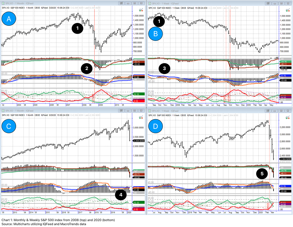
I will quickly orient you to the charts. Chart A is a monthly chart and Chart B is a weekly chart focused on the 2007-2008 period. Chart C is also a monthly chart and Chart D is a weekly chart focused on present day. As I have mentioned in past newsletters, it is vitally important to look across timeframes as the market is made up of cycles within cycles. Price is in the top half of the charts and three of my proprietary indicators are added to the lower half of the charts.
Point 1 (both on charts A and B) is the price peak before 2008 crash. Points 2 and 3 illustrate my indicators slowly turning. Soon after the peak in late 2007, the fast moving averages crossed below the slow as the actual indicator crossed below zero. These are very bearish formations and paved the way to the nearly 30% market drop (highlighted in Table 2 above) that occurred in October of 2008. The red, dotted, vertical, line on chart B followed by the red, solid, vertical line represent the four week period cited in Table 2. This occurred well off the market highs.
By contrast, in January and February of this year, the S&P 500 was making new highs. The indicators at point 4 were mostly bullish - top indicator was above MAs, middle indicator was neutral, and bottom indicator was also neutral but leaning towards the bullish side. Moving to point 5 on the weekly, the top two indicators were clearly trending higher and the bottom indicator was indicating overbought potential, highlighted in the
"
Crashing Up?
"
January newsletter. In fact, in that moment, the market was ignoring the Coronavirus (COVID-19)
Prior to the aggressive selloffs in both 2000 and 2008, the market gave a clear indication it was changing its mood or trend. This time, the market turned on a dime, which is actually very rare.
So, the Bubble has Burst?
Yep.
In the ten years of this bull run, the market has appreciated
400%+
from the lows in 2009 to the top in February. The recovery out of the Great Recession was accelerated by a tremendous amount of stimulus from Central Banks around the world. The U.S. Federal Reserve kicked off Quantitative Easing (QE1) and infused approximately $1.75 Trillion into the economy through the form of bail outs, purchasing mortgage backed securities, longer-term Treasure Securities among other things.
1
This stimulus package paved the way for cheap money and there were additional stimuli along the way to keep the economy rumbling full-steam ahead.
Towards the middle of 2015, the market began to flatten. Some European countries still had not recovered from the Great Recession of 2008. Oil prices were once again on the decline and were weighing heavily on the energy sector and applying significant pressure to oil producing nations. To make matters worse, the Fed had just raised interest rates for the first time since 2008. (Let that sink in, for over seven years interest rates remained unchanged while the market and economy steamed ahead.)
The market was at a critical decision point. The lower timeframe charts were weak and out-of-phase with one another. It is my opinion, the strength of the quarterly chart managed to pull us out of it at that moment as lower timeframes often yield to the guidepost of the higher timeframes. Since that point, it has been my opinion that the balance of the bull run / bubble was on “borrowed time.” That is not to say that I sat on the sidelines as I was definitely a participant in the markets but I always approached longer-term trends with an added degree of caution. Here’s why…
The Curse of Capitalism: Credit
Our modern capitalistic economy is fueled by consumption. This consumption is key as it creates profits, jobs, etc. So long as consumption is there, everything works well. When consumption lags, credit is loosened so buying can continue. To be clear, credit and capitalism is not a problem; too much consumption on credit is an issue as, eventually, we reach our limit and have to pay the debt collector.
According to nerdwallet.com, the total consumer debt of the United States is
$
14.15 Trillion
. About two-thirds of this is tied to mortgage debt. There’s another $1.3 Trillion in auto loans and nearly
half a trillion
in revolving
credit card debt
- balances carried from month-to-month.
2
Keep in mind, this is expensive debt, often hovering around 20% APR.
Median household income has been on the rise, estimated around $61.4k per year in 2017, an increase of about $20k (+48%) per year compared to 2000 status. Unfortunately, our debt levels have risen at a faster pace. In 2000, average household debt was about $51k compared to $137k in 2017.3 This is
169%
increase is debt levels over the same period. It is difficult to find detailed information at a household level on debt to income ratios but it is a safe assumption many Americans are carrying a heavier debt amount compared to prior decades… and why not, interest rates have been relatively low and the economy has been firing on all cylinders with extremely low unemployment levels.
Enter Global Pandemic
Here we were, ringing in a new decade, everything going well - living our best lives - when this new coronavirus was caught by a few… and then a few more… and so on. Before long, China had taken extreme - but in hindsight, appropriate - measures. The world is flat these days and global travel is extremely common, especially around Lunar New Year; historically the largest human migration. Before long, it had reached many corners of the globe.
As of this writing, nearly 25% of Americans are under some form of ‘stay-in-place’ orders. Consumption, the life blood of our economy, has been severely disrupted. The travel industry was the first to feel effects but with many municipalities placing bans on ‘large gatherings’, now many industries - restaurants, hospitality, entertainment, etc. - are being impacted. Households living paycheck-to-paycheck suddenly find themselves in a precarious position, as do small and medium business owners who may not have deep reserves to weather an extreme occurrence like this. Large companies who opted to buy back their own shares over the past few years probably wish they had more in the ‘rainy day fund’ considering they are likely under water on their re-purchases.
In 2008, it was pretty easy to point the finger. The banking industry made high risk loans to under-qualified borrowers for too long and their house of cards crumbled and took nearly all of the liquidity out of the system. Because the banks couldn’t back loans, other industries - automotive, capital equipment, housing - were impacted. Enter the U.S. Federal Government and their bailouts under the battle cry “too big to fail.”
Now there are millions of people, thousands and thousands of small and medium businesses who are cut off by the lack of consumption. Liquidity and cash flow are the essential ingredients to stay afloat; to pay employees, to pay rent, to pay for essentials. The trickle-down effects - businesses closing, layoffs, missed rent payments - similar to the spread of a virus, are magnified at an exponential rate.
Things don’t always happen on your time.
As mentioned in my
2020 Vision
newsletter, I entered this year with optimism. I utilized a combination of tools at my disposal and walked through my rationalization. I put a lot of stock (pardon the pun) into the fact this is an election year with an incumbent in office. Since 1950, the market has never ended down in this situation. The market was also giving classic bubble traits, such as ignoring bad news. My indicators had the market as clearly overbought, however, it has functioned in this state for the last couple of years.
I had eluded to, in my newsletter, that I was expecting a significant down move but was under the impression it would be after the presidential election or early 2021. I had shared with friends that I believe when it was going to happen it would be a move of 40%-65% to the downside.
I did not expect the move to happen at this point but it is happening. As an investor, you have to be in the now moment and adapt to where the market is moving. You have to trust your plan and your tools.
The Red Dot Day
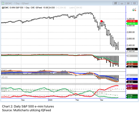
The last time I wrote was on Leap Day, 2/29/2020. A couple of days later, 3/3, my system signaled a red dot on the daily S&P 500 e-mini futures chart. Coupled with the right timeframe alignment, this is a reliable signal. At the time, the market had already dropped a considerable amount (given the context of the move to that point.) I actually doubted this signal would actually work and did not take action. One of my rules is if I am not crystal clear on a trade, I should pass. There are always other opportunities on other days. In hindsight, the signal worked perfectly and I was a bit frustrated as this is the move I’ve been expecting for several years now.
Okay, original plan of 20% up on the year is off the table. Where does this market go from here? It is certainly not an easy question to answer. Looking at the weekly S&P 500 e-mini futures chart (3), we closed Friday near critical support. We slightly breached the lows set in December 2018, which, from a technical analysis point of view should offer support. This also happens to coincide with an indicator that is tied to the nine week chart (the dark green line directly below price in chart 3.) When the lower timeframe (the daily) is oversold, which it is, this level can offer support. In addition, the price action on the daily acts as if it is trying to find a bottom.
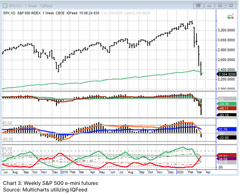
I am doubtful we hold at this level though. I am hopeful but doubtful. If this support level does not hold I will be looking for further opportunities to the downside. The zone of support appears to be in the
2030 zone
on the S&P 500 index. It is certainly possible that we do not bottom until the
1715 zone
, which is based on the 61.8% Fibonacci Ratio, a reliable re-tracement level.
In my last newsletter, I mentioned permanent damage had been done to the charts from a technical perspective. That was on a small portion of this move so you can imagine how blown out the charts are now. Should some stimulus package be agreed upon, the market may rally. I think these rallies will serve as bear market re-tracements, despite how convincing they appear to be. The market appears as if it needs to cycle through a bear market before the next bull market can take over. This last occurred on the quarterly S&P 500 index chart between 2000 and 2009.
The market is currently undergoing a significant shift. If your investment portfolio is down over 30%, you are not beating the market. It might be a perfect time to review your portfolio and talk to a professional you trust to ensure your investments are working toward your long-term goals. After significant market moves, like the one we witnessed over the last month, is when portfolio recalibration can be helpful.
1 federalreservehistory.org (https://www.federalreservehistory.org/essays/great_recession_of_200709)
2 nerdwallet.com (https://www.nerdwallet.com/blog/average-credit-card-debt-household/)
3 debt.org (https://www.debt.org/faqs/americans-in-debt/demographics/)
Disclosure: At the time of writing, I have no open position in any aforementioned company. I have not received compensation for this piece nor do I have business relationships with any company whose stock is mentioned in this article. I wrote this newsletter myself and it expresses my own thoughts, opinions, and views.
Justin Toedtman is a market strategist and contributing editor to Momentum Private Wealth Management. For the last 20 years, his focus has been on technical analysis and market strategies.
If you are not having frequent conversations with your wealth or investment advisor about market strategies, investment management, or financial planning opportunities, you should be, especially in a market like this!
Momentum Private Wealth Management
specializes in Wealth Management as well as Comprehensive Financial Planning. Feel free to reach out to Austin directly at 512.416.8085 or austin@momentumpwm.com. You can also find out more information about MPWM at:
www.momentumpwm.com.
You can also read more about Austin on his
LinkedIn Page
,
CFP® Professional Certificate Page
or on his
XY Planning Network Profile page.
The information on this site is provided “AS IS” and without warranties of any kind either express or implied. To the fullest extent permissible pursuant to applicable laws, Momentum Private Wealth Management, LLC (referred to as “MPWM”) disclaims all warranties, express or implied, including, but not limited to, implied warranties of merchantability, non-infringement, and suitability for a particular purpose.
MPWM does not warrant that the information will be free from error. None of the information provided on this website is intended as investment, tax, accounting or legal advice, as an offer or solicitation of an offer to buy or sell, or as an endorsement of any company, security, fund, or other securities or non-securities offering. The information should not be relied upon for purposes of transacting securities or other investments. Your use of the information is at your sole risk. Under no circumstances shall MPWM be liable for any direct, indirect, special or consequential damages that result from the use of, or the inability to use, the materials in this site, even if MPWM or a MPWM authorized representative has been advised of the possibility of such damages.
In no event shall MPWM have any liability to you for damages, losses, and causes of action for accessing this site. Information on this website should not be considered a solicitation to buy, an offer to sell, or a recommendation of any security in any jurisdiction where such offer, solicitation, or recommendation would be unlawful or unauthorized.